Control GMC refreshes its brand identity on the occasion of its 40th anniversary

Boucherville, August 20, 2025 – To mark its 40th anniversary, Control GMC is proud to announce the refresh of its brand identity. This initiative reflects the company’s commitment to strengthening its market positioning while remaining true to its core values and projecting a modern, distinctive, and forward-looking image. Context In today’s competitive landscape, it is essential for a company’s brand identity to be both representative of its DNA and aligned with its ambitions. A thorough comparative analysis identified both the strengths and opportunities for improvement in Control GMC’s visual identity. This reflection led to the creation of a renewed brand image, designed to embody the reliability, flexibility, and innovation that have defined the company for four decades. A bit of history Since its founding in 1984, Control GMC’s brand identity has undergone several transformations:
  • The first brand identity (1984 – early 2000s) featured a black-and-white wordmark, with the letters GMC framed in a visual box.
  • In the early 2000s, designer Jeff Gauthier modernized the image by turning these frames into dark blue squares positioned above the GMC letters, symbolizing containers moving along a packaging line.
  • Today, the third evolution, developed in collaboration with marketing agency Morin Strategic Partner, represents a bold new stage with a stronger, more symbolic identity aligned with the company’s present and future ambitions.
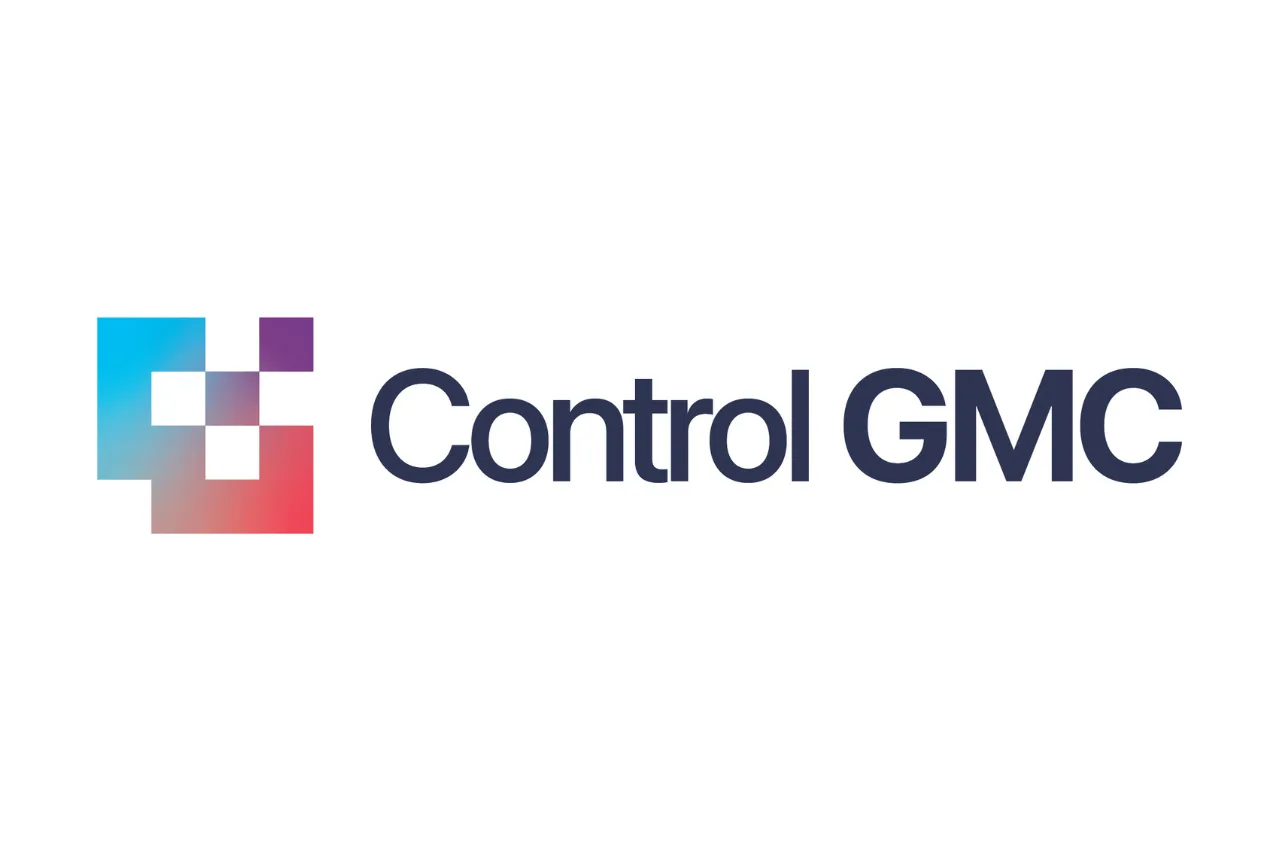
A redesigned logo Control GMC’s new logo embodies the company’s renewed vision. Its pixel-like square graphic element symbolizes innovation and modularity, reflecting the company’s ability to adapt to the challenges of a constantly evolving manufacturing environment. The gradient of blue, violet, and red evokes progression and adaptability, while the deep blue typography inspires trust and expertise. This logo asserts a strong, flexible, and dynamic identity, perfectly aligned with Control GMC’s mission: to support manufacturing companies in their transformation and growth. A meaningful color palette The new visual identity is built around a carefully selected color palette:
  • Deep blue: symbol of elegance, reliability, and durability.
  • Turquoise green: a reflection of innovation and technological precision.
  • Deep violet: embodiment of professionalism and the constant pursuit of excellence.
  • Energetic red: expression of passion, efficiency, and commitment to customer satisfaction.
A forward-looking slogan This refresh comes with a new positioning slogan: “Grow with full flexibility.” This slogan embodies Control GMC’s promise to provide technological solutions and modular equipment that enable businesses to grow and quickly adapt to new market demands. Words from the founder “For 40 years, we have built Control GMC on values of reliability, innovation, and proximity with our clients. Today, with this refreshed brand identity, we are writing a new chapter while remaining true to our mission: to provide manufacturing companies with flexible, high-performance solutions capable of adapting to the realities of a constantly evolving market.” — Gaétan Chagnon, Founder and President of Control GMC About Control GMC Founded in 1984 and headquartered in Boucherville, Quebec, Control GMC is a North American leader in the design and manufacturing of automated packaging solutions. The company develops container filling and sealing lines, pail closing machines, and a complete range of depositors for solid, liquid, and semi-solid food products. Its equipment—renowned for reliability, modularity, and efficiency—is used by leading food companies across North America and internationally. With proven expertise and a collaborative approach, Control GMC supports its clients in optimizing their operations and driving sustainable growth. Progressive rollout The refreshed brand identity will be rolled out gradually across all platforms and communications during the fall of 2025.